Lead Summit
My Role
Branding | Web design | Social media communication
Timeline & Status
2025, 2 months
Overview
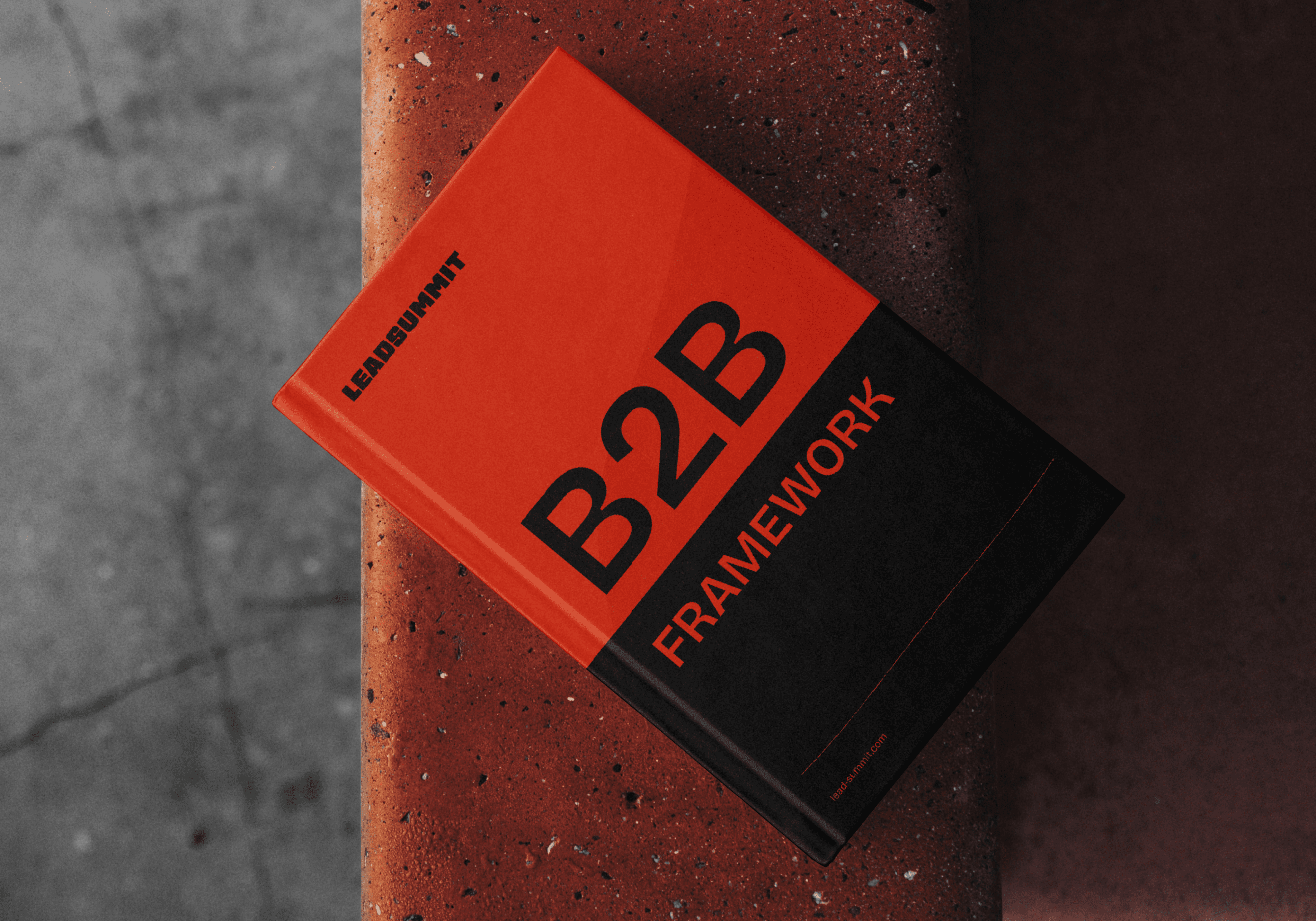
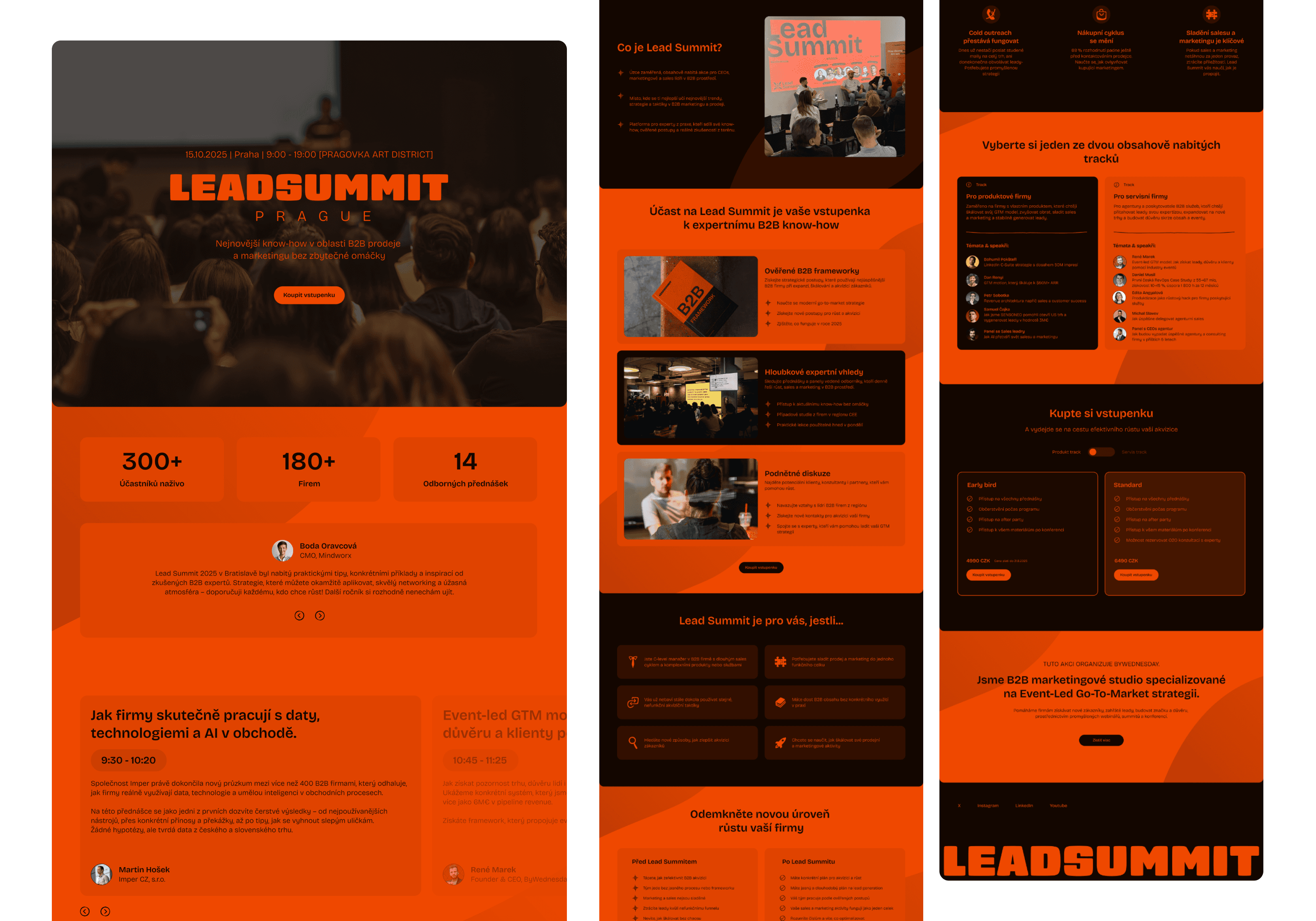
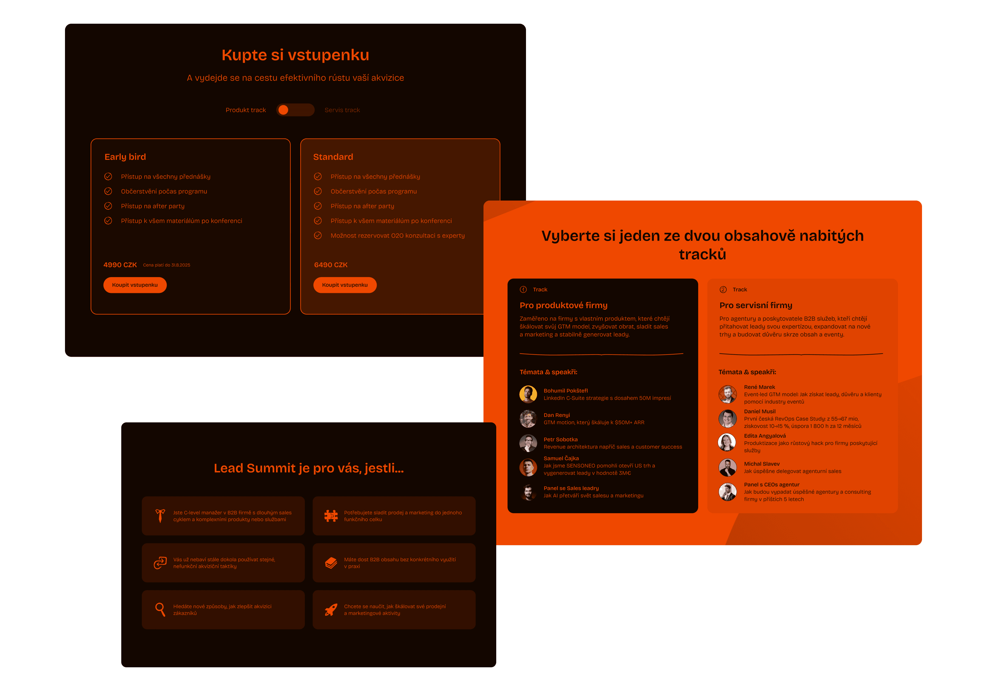
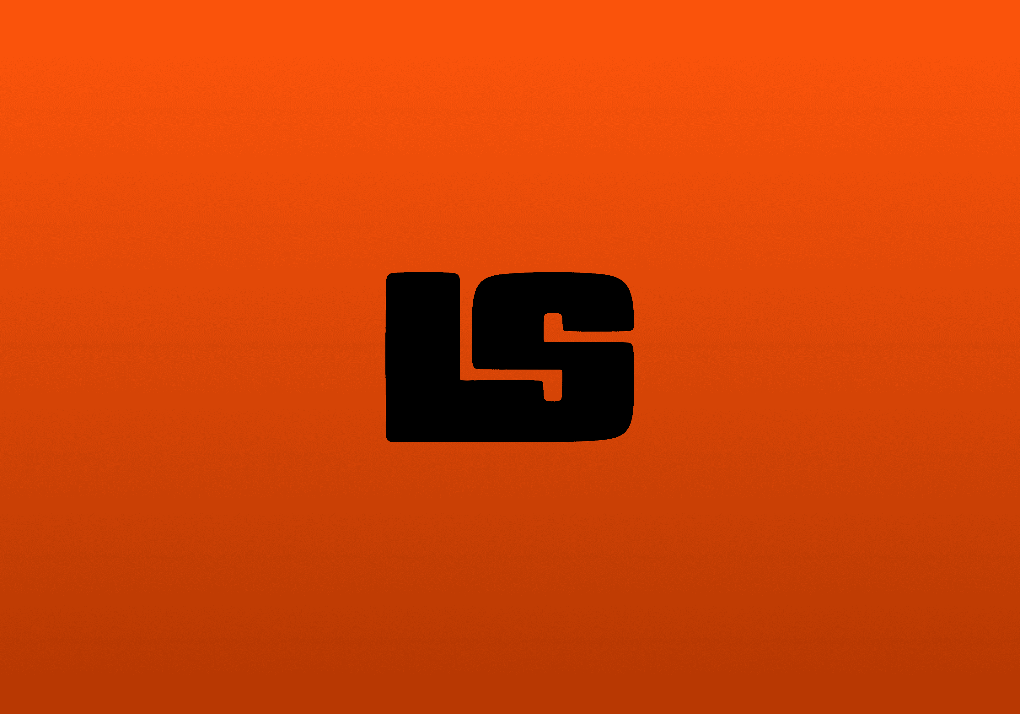
Lead Summit is a marketing conference with a dynamic and flexible visual identity, designed to capture the fast-paced nature of lead generation. The branding is built around bold, heavy typography and anchored by a strong, vibrant orange as the key element, giving the event a striking and memorable presence.
Bold by design…
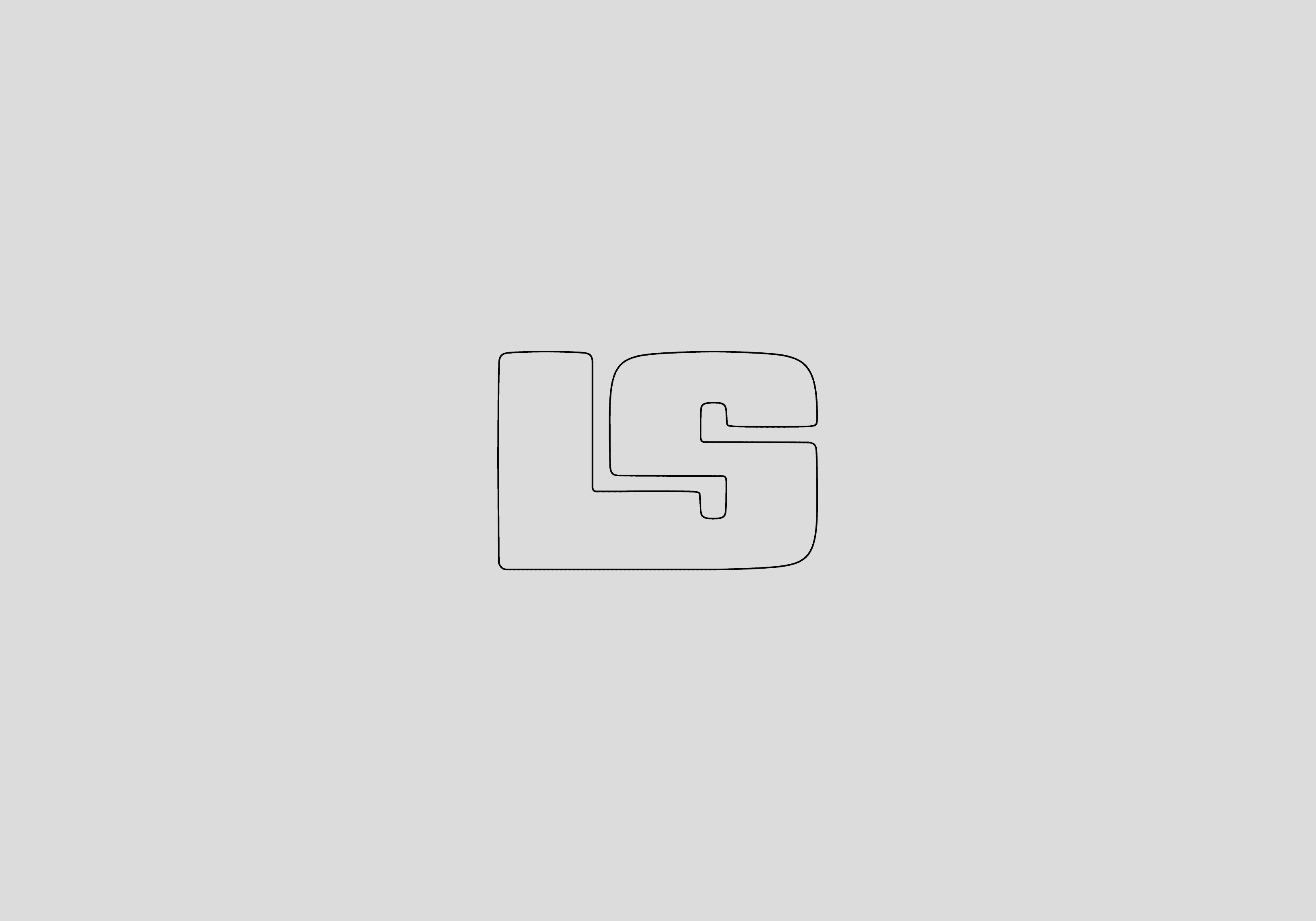
The logo is built on bold, impactful typography. To ensure versatility across different contexts, three logo versions were created — from the full wordmark to the shortest form, a compact “LS” symbol, where the two letters are visually connected.


Shades of impact…
The color palette is led by a strong, dense shade of orange as the primary brand color, complemented by a very dark brown and enriched with gradient in varying tones of the core orange. The chosen typeface, Bricolage Grotesque, brings an elegant counterbalance to the bold logo and hand-drawn graphic elements.


Doodles with purpose…
Hand-drawn elements add a playful, almost childlike layer to the branding. Their role is to enrich icons or bring life to otherwise plain social media posts, adding character and informality to the overall visual identity.
Evolving across platforms
The branding has already been applied across numerous social media posts, the website, and various marketing campaign layouts. It was intentionally designed to feel almost unfinished, allowing it to evolve continuously and never restrict creativity. Feels over rules this time...